How to get more value out of screenshots on your home page
(This originally appeared in my newsletter. Sign up now to get content like this, for free, every Monday.)
Today I'm going to talk about the practice of putting screenshots on software company home pages. Let's start with a quick summary.
Quick summary:
Lots of companies use the wrong screenshots - focusing on boring inputs rather than valuable outputs. If you must use a screenshot, show a screenshot of your software's outputs.
Static screenshots only show a snippet of the how the software gets used. Think about using gifs or short videos instead.
Screenshots take up a ton of real estate when you put them at the top of the page. Is that truly the best use of that valuable space?
(You can also see a two minute video with most of these thoughts on Linkedin.)
Okay, now let's get into the details.
Here's something I've seen across lots of different software companies' home pages: screen shots of the product.
Like this - here's Pipedrive:

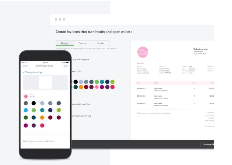
And here's Quickbooks Online:
You get the idea.
I think companies should be a bit more strategic about how they use screenshots on their websites. Often, there are better ways to use the real estate they take up - or better ways to use screenshots.
Here's three questions you should ask yourself before you put a screenshot on your home page:
Are you using the right screenshot?
One thing that I see a lot of is a screenshot of the base UI - the bit of the software that you use every day.
This is nice for telling people what they're buying, but it's not that great for communicating the value of what they're buying.
The way you use software day-to-day is really just part of why someone would buy it. And it's a bit of of software that doesn't get communicated very well in a screenshot.
To be fair, Quickbooks Online is doing a pretty good job of this in the example up above. They're showing how you can make invoices right in the app - and what those invoices look like.
Microsoft also do a great job of this on their landing page for Excel. Here's what they've run with:
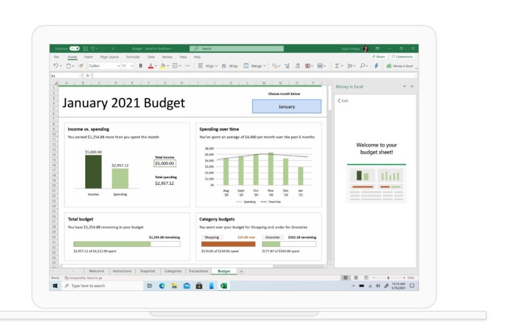
Looks pretty cool! Shows the kind of things you could do with Excel. And that makes a lot of sense, because if Microsoft went with a "how you use it" screenshot, it would look something like this:

Zzzzzzzzzzzzzzzzzzzzzzzzzzzzzzzz.
When software companies with nicer-looking UIs lead with their "how you get information in" screenshot (like Pipedrive did), they're basically a nicer-looking version of this. Not that compelling.
Why is it static?
Software is fundamentally dynamic. It's about getting information in, doing something to it, then getting information out. This is really hard to communicate in a static screenshot.
As a simple example, my time tracking software is about tracking how much time I spend on various tasks (getting information in), classifying that time (doing something to it), then checking retroactive reports to figure out what my hourly rate was on projects, how much time I spent on business development (too much), and so on and so forth. That's the getting information out bit.
A screenshot can show a snippet of that journey, but the real value of the software is in the whole journey.
I think a lot of companies are missing a trick by using static screenshots rather than gifs and short videos to show the actual use case for their software - rather than just one tiny part of it.
What's your opportunity cost?
This is mostly true for screenshots at the very top of the home page. The top of your home page is real make-or-break stuff. It's your opportunity to tell people what you do, who you do it for and why people should work with you, and convince them to keep scrolling (or if you're lucky, take action immediately).
Again, this is an area where I think Quickbooks Online did a better job than Pipedrive. QBO had a screenshot - but they put it further down the page. Pipedrive blasted it right at the top of their home page.
If you're going to include a static screenshot in that high-stakes spot, you should think very carefully about whether it is the best use of that spot. Would you be better off showing people the outcomes that your software delivers? You can do this with words, diagrams, video - or a combination of all three.
Once people are scrolling down, there's lots of scope for screenshots because people are a bit more invested, and they're keen to learn more. But I have a hard time seeing the argument for screenshots at the top of the page. Save them for the people who are more interested in finding out more about what you have to offer.
That's all
That's all I have to say about screenshots on your home page. There are some good use cases out there - generally further down the page, in a way that communicates the value of your product, rather than just showing how it looks when someone's using it.
But by and large, I'd think carefully about using one. They may not be the worst use of that page real estate, but they're certainly not the best either.
See you next week
Sam
PS: You can see a two minute video of me talking about this issue. Take a look on Linkedin. Leave a comment!
PPS: If you're using screenshots on your home page, and are out of ideas for what else you could put in the spot, I can help you. Just book a home page review - $799.
If you like what you just read, you can get content like this delivered straight to your inbox at 8am every Monday. Sign up now.