Four easy ways to make your demo pages better [WITH VIDEO]
(This originally appeared in my newsletter. Sign up now to get content like this, for free, every Monday.)
You're probably familiar with the "book a demo" call to action. You click the button, fill out a form, and a salesperson shows you the product. It's a sales call.
There's obviously a lot to be gained from optimising these pages. More demos means more revenue; even the people who don't buy right away are now leads you can nurture for months or years into the future.
Yet, over the past couple of weeks, I've looked at maybe 50 or 60 demo landing pages. And almost every single one can be improved.
Here are some basic things you can do on your demo page to get more people to fill out the form and book a call with your sales team.
#1: Include more than a form!
You click the "get a demo" button, and it takes you to the landing page. That landing page has just one thing on it: the demo form. Or, the form just pops up in situ.
I get the thinking behind this. Remove distractions and barriers. Laser-focus people on the one thing you want them to do.
But here's the reality: it's not that hard to make a form obvious on a page while including some other information as well.
And that information could well be the difference between people wavering and clicking X, and filling out their details.
Fact is, if people have clicked "get a demo," they are pretty committed. They are unlikely to be dissuaded by some extra stuff on the page.
But, a minority of people may need a bit more information to get them across the line. So by adding that information, you're capturing this wavering group, without really costing anything.
Natural question from that: what information do we include? Well, keep reading
#2: Sell the demo, not the product
The other big mistake I see is companies that do put some copy around the demo form - but that copy is about the product, not the demo. Here's an example, from a company called HubbubHR:
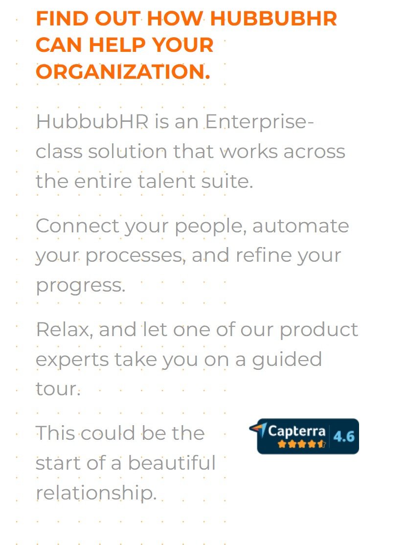
Can you see the issue? The copy is talking about the product - not the demo. But the page's purpose is to get people to sign up for a demo!
When you're putting your demo landing page together, it pays to remember that the people on this page have already bought in to your wider benefits. Now they're taking the next step to get that substantiated.
So don't waste your time reminding them of the stuff they've already bought into. Rather, give them information that helps them take that next step.
(Check out this 2.5 minute video of me talking through this exact issue)
Here's an example of someone who did a better job of this. This is a popup builder called Sleeknote:

See the difference? I can quickly skim this copy and see the broad brush strokes of exactly what’s in the demo. I can also see - crucially - how long it is. More on that in a second.
#3 - tell us how long it is!
Not much more I can say about that one. It's pretty amazing how common this is though. The range of time commitments for demos is really big - from 15 minutes through to an hour.
To make it easier for someone to make this commitment, it's useful to tell them what they're signing up for! So just make sure there's some text in there letting them know. And be specific. "Short demo" won't cut it. "15 minute demo" will.
#4 - add some social proof
Your demo page is an area where testimonial quotes can really come into their own. Get some logos, pictures and highly specific quotes up there - just to remind people of what their future state could look like, as long as they put in their details.
(Give this short article a readbefore you start putting testimonial quotes in willy-nilly).
That's it
It's easy to fall into this trap of thinking that once someone's clicked "get demo," you've got them. And for lots of people, this is true. But each person you get signed up for a demo isso valuable.That's why it makes sense to do everything you can to snag as many as possible.
Have a great week.
Sam
PS: I started reviewing demo pages after I read this great linkedin post by copywriter Eden Bidani. She rewrote her client's demo landing p age, andincreased its conversion rate by thirty percent.She did a great slideshow of her process and the changes she made over on Linkedin.Go check it out.
PPS: Do you reckon your own demo page could use some work?Book a review - $799. I know the service is called "home page review," but really I'll do it for any landing page.
PPPS: Or if you know you need a new demo landing page, ASAP, just get me to write it for you. I can have copy ready for you this time next week.$1,999. Book now.
If you like what you just read, you can get content like this delivered straight to your inbox at 8am every Monday. Sign up now.